Look: layouts and button styles
Choose how an offer's product rows and button look in checkout: Inline, Classic or Card, and an Outlined, Filled or Plain button.
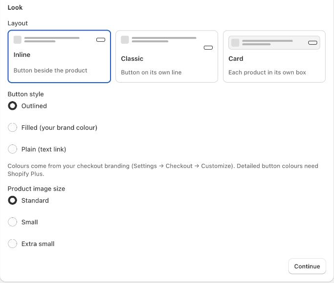
The Look section decides how an offer's product rows and its button look in checkout: where the button sits next to the product, whether each product gets its own box, the button style and the size of the product image. Use it to make offers match your checkout, for example a filled button in your brand colour.
Where to find it: Oxify Cart Drawer → Checkout Offers (Beta) → open an offer → the step that lists its products (for example 1 · Products) → Look. The table below names the step for each offer type.
Which offers have it
| Offer type | Where the Look section is | What you can change |
|---|---|---|
| Product upsell | Products step | Everything |
| Upgrade | Upgrade step | Everything |
| Bundle | Bundle step | Everything |
| Free gift | Gift step | Everything |
| Progress bar | Close the gap step, once Suggest products that close the gap is ticked | Everything, for the suggested products |
| Edit items | What buyers can change step, under the subscribe button text once Switch to subscription is ticked | Button style only (the subscribe button) |
Messages, trust badges, testimonials, gift notes, questions, add-on checkboxes and item protection have no button row, so they have no Look section. A Message has its own Look choice (Plain or Highlighted); see Messages, trust badges and questions.
Set the look
Open the offer and the step named in the table above. Scroll to Look.
Under Layout, click a card: Inline, Classic or Card. The preview on the right changes straight away.
Under Button style, choose Outlined, Filled (your brand colour) or Plain (text link).
Set the extra options that appear for your layout (see the table below), then click Save.
Switch the preview between Desktop and Mobile to check both. Real checkout uses your store's own fonts and colours.
Every setting
| Setting | Choices | Default | What it does |
|---|---|---|---|
| Layout | Inline ("Button beside the product"), Classic ("Button on its own line"), Card ("Each product in its own box") | Inline | Where the button sits and whether each product is boxed. |
| Button style | Outlined, Filled (your brand colour), Plain (text link) | Outlined | How the button looks. |
| Button width | Fit the text, Full width | Fit the text | Shows only for Classic and Card, and not with Plain. Full width stretches the button across the row. |
| Box padding | Tight, Standard, Loose | Standard | Shows only for Card. The space inside each box. |
| Product image size | Standard, Small, Extra small | Standard | The size of the product thumbnail. A product upsell with the image set to Large, above the details (under More options) has no thumbnail, so this setting is hidden. |
Every offer, including offers saved before the Look section existed, starts as Inline with an Outlined button.
The layouts
Inline puts the button beside the product: image, details, then the button on the right.
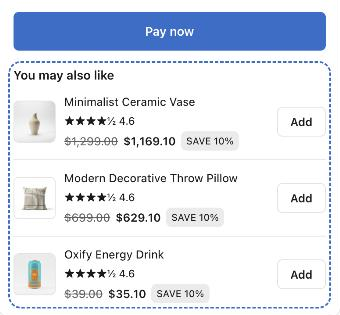
Classic puts the button on its own line under the product. On wide rows it sits on the right; on phones, or with Full width, it fills the row.
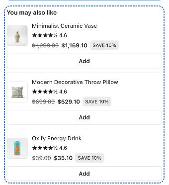
Card puts each product in its own shaded box with a border, with the button beside the product. With Full width, the button goes under the product, across the box. A bundle in Card shows the whole set in one box.
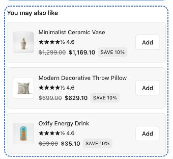
The button styles
- Outlined: a button with a border. It suits most checkouts.
- Filled (your brand colour): a solid button in your checkout's main colour, the same style as the Pay now button. Use it to make the offer stand out.
- Plain (text link): the button text as a link, without a box. Use it for a quiet offer. In a carousel, the Previous and Next arrows keep an outlined style, because a small link is hard to tap.
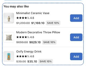
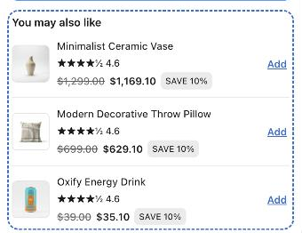
Colours come from your checkout branding
Oxify only picks the button style. The colours come from your checkout branding in Shopify (Settings → Checkout → Customize). The app says: "Detailed button colours need Shopify Plus."
On phones
- A variant picker, a quantity selector and the one-time or subscription choice always go on their own lines under the product, so they never squeeze the button.
- In Inline and Card, a short button text stays beside the product on a narrow screen. A longer text, more than 12 characters (for example "Add to my order"), drops under the product and fills the row. Keep the Button text short if you want the button beside the product on phones.