Progress bar setup
Configure single-tier or multi-tier progress bars and their visual style.
Single tier vs multi-tier
The bar is built from your reward tiers, so there's no separate mode to switch on:
- Single tier — One reward, one goal. Best for new stores or simple "Free shipping at $50" promos.
- Multi-tier — Up to 6 tiers on one bar. Tiers are ordered by goal, lowest first, so customers see the next reward unlocking as they shop.
By default the rewards sit at equal distances along the bar. Turn on Space rewards by value (under Show Advance Settings in General Settings) to place them according to their goal amounts instead. It isn't available in Style 4 - Bubble.
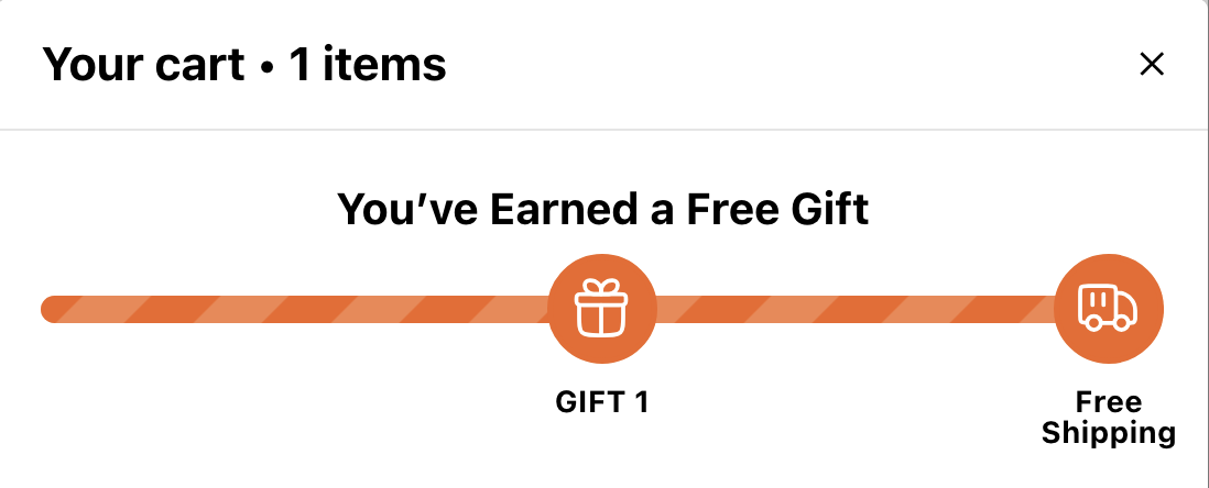
Goal text
Three text fields control what shoppers read:
- Text Before Achieving Reward (in each reward) — The message above the bar while that reward is the next one to unlock, for example "You’re
{AMOUNT}away from free shipping!". Use{AMOUNT}(Cart Total) or{COUNT}(Item Count) to show what's left. - Reward Description (in each reward) — The label for that reward on the bar. With Cart Total you can use
{{min_amount}}to show its goal amount. - Text after completing full rewards bar (under Other Settings) — Shown once every reward is unlocked.
Keep labels short: they sit under the bar and wrap onto more lines when they're long, so check the preview.
Display style
Click View Templates at the top of the Rewards screen and choose a style with Apply Template. New stores start with With Icons.
- Default — Classic progress bar with a text label under each reward.
- With Icons — An icon for each reward on the bar. Pick one per reward, or upload your own.
- Style 3 - Center and Check — Each label is centred on its section of the bar and wraps to fit it. Once a reward is unlocked, its label switches to Reward Description After Achieving (if you've filled it in).
- Style 4 - Bubble — A row of bubbles, one per reward, each with a check mark. There's no progress bar. Best for percentage-off rewards.
- Style 5 - Horizontal Milestones — Horizontal milestones with lock icons that turn into checks, plus each reward's label and goal (an amount, or a number of items) underneath.
Applying a style resets the Design colors and sizes, and each reward's icon, to that style's defaults — so choose the style first, then fine-tune. The Design card sets the background color, title size, icon colors (achieved and unachieved), the progress bar (or bubble) colors, and the size and color of the reward descriptions.
Confetti / celebration
Turn on Show Confetti when reward is achieved (General Settings) to fire confetti for about 5 seconds each time a reward unlocks. It's a single on/off switch for all rewards, and it's off by default.