Cart item display
Configure cart item design — image dimensions, borders, typography for each element, quantity selector, and product savings display.
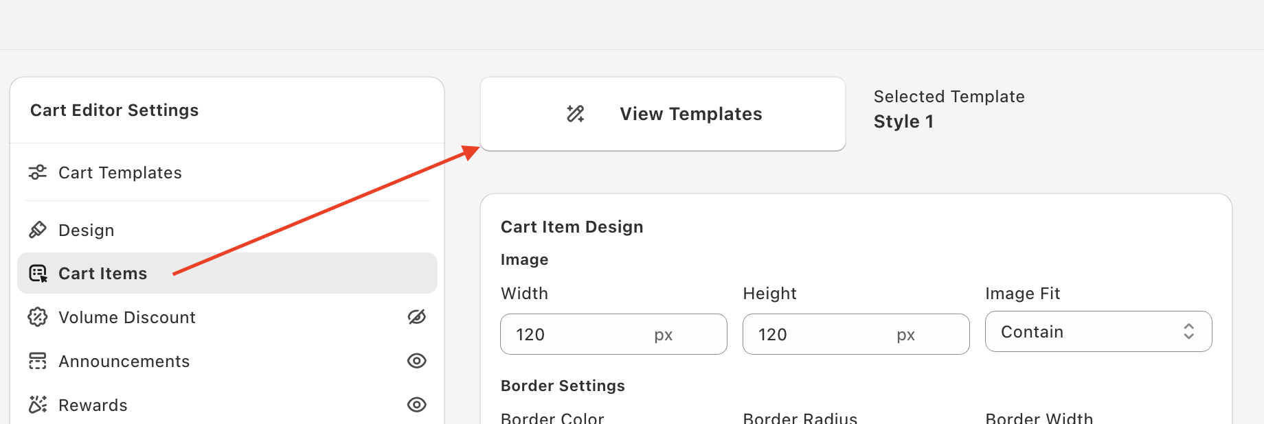
The Cart Items panel controls the design of every product line item shown in the cart drawer — image size, typography, border, prices, quantity selector, and savings display. Open Cart Editor → Cart Items.
View Templates
Click View Templates at the top of the panel to browse pre-built cart item styles — Style 1, Style 2, and Style 3 (Compact). Each template applies a consistent visual style across every cart item. The currently active template is shown next to the button (e.g. Selected Template: Style 1).
Click Apply Template on a card to use it. Picking a template overwrites the values in the Cart Item Design card (image size, borders, font sizes, colors, etc.) with the template's values. After picking a template, you can still tune individual values to fine-tune the look.
The defaults on this page are for Style 1; Style 2 and Style 3 (Compact) start with their own values.
Image
Controls the product thumbnail shown for each cart item.
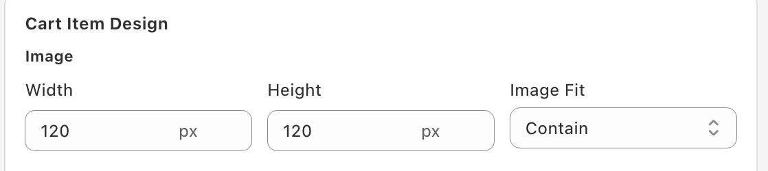
- Width (px) — default 120px. Set the pixel width of the thumbnail.
- Height (px) — default 120px. Set the pixel height of the thumbnail. Equal width and height keeps thumbnails square; mismatched values create rectangular thumbnails.
- Image Fit — controls how the product image fills the box: Contain (default) shows the full image (may leave whitespace), Cover fills the box and crops the edges, and Fill stretches the image to the box.
What to pick: 100–120px works for most stores. Larger thumbnails feel premium but reduce how many items fit above the fold. If your product photos have important edges (e.g. apparel, accessories), use Contain to avoid cropping.
Border Settings
A subtle border around each product image (not around the whole cart item).
- Border Color — hex color value (e.g.
#E5E5E5for a light grey). Use#0000for transparent. The default is transparent. - Border Radius (px) — corner rounding. 5px is the default. 0px gives sharp corners; 10–15px gives modern soft corners.
- Border Width (px) — thickness. 1px is the default; thicker borders look heavy.

For most stores, leave the border subtle — light grey or transparent with 1px width. Heavy borders compete with your product photos.
With the Style 2 template, an extra Item Container control (background color and border radius) styles the card behind each item.
Typography for each text element
Each text element on the cart item has three controls — Text Color, Font Size, and Font Weight.
[Screenshot: Cart Item Design panel showing Title, Subtitle, Original Price, Final Price, and Discount Code typography controls]
Title
The product name. Default: #000000 / 14px / Bold. Bold helps the product name stand out as the primary line.
Subtitle
The variant info (size, color, etc.) shown below the title. Default: #6c6c6c (medium grey) / 12px / Regular. Smaller and lighter than the title — variant info should be readable but not compete with the product name.
Original Price
The pre-discount price (shown with strikethrough when a discount is applied). Default: #999999 / 12px / Regular. Light grey because it's secondary information — the customer should focus on the final price.
Final Price
The price the customer is actually paying. Default: #000000 / 16px / Bold. Bigger and bolder than the original price — this is what customers should anchor on.
Discount Code
When a discount applies to a line item, the discount's name is shown under the product with a small discount icon, and these controls style it. Default: #61677c (dark grey-blue) / 12px / Bold. The bold weight signals it's a coupon-related callout. This control appears with the Style 1 and Style 3 (Compact) templates.
Quantity Selector and Delete Icon
- Quantity Selector ( Color and Size ) — the text color and size (px) of the quantity selector. Default size 16px. Match the color to your title color (typically
#000000) for visual consistency. - Quantity Selector ( Border Color and Radius ) — the selector's border color and corner radius (px). Defaults:
#61677C66and 5px. - Delete Icon — the color and size (px) of the remove-item icon. Defaults:
#61676Cand 16px.
Other Settings
Below the design controls, the Other Settings card has additional cart item options.
Show Product Unit Price
Displays unit pricing like $5.00 / 1 kg below the line price. Useful for grocery, beauty, supplements, and pet stores where customers compare per-unit cost.
Only renders when unit pricing is configured on the product in Shopify. If you haven't set up unit pricing in Shopify admin, turning this on has no effect.
When on, Product Unit Price Text lets you rewrite the line (default {{unit_price}} / {{reference_value}} {{reference_unit}}; click the variable icon to see every variable), and you can set the Unit Price Text Color, Unit Price Font Size, and Unit Price Font Weight.
Allow customers to change product variant in cart
When on (it's off by default), eligible cart lines show a dropdown so shoppers can switch variants without leaving the cart.
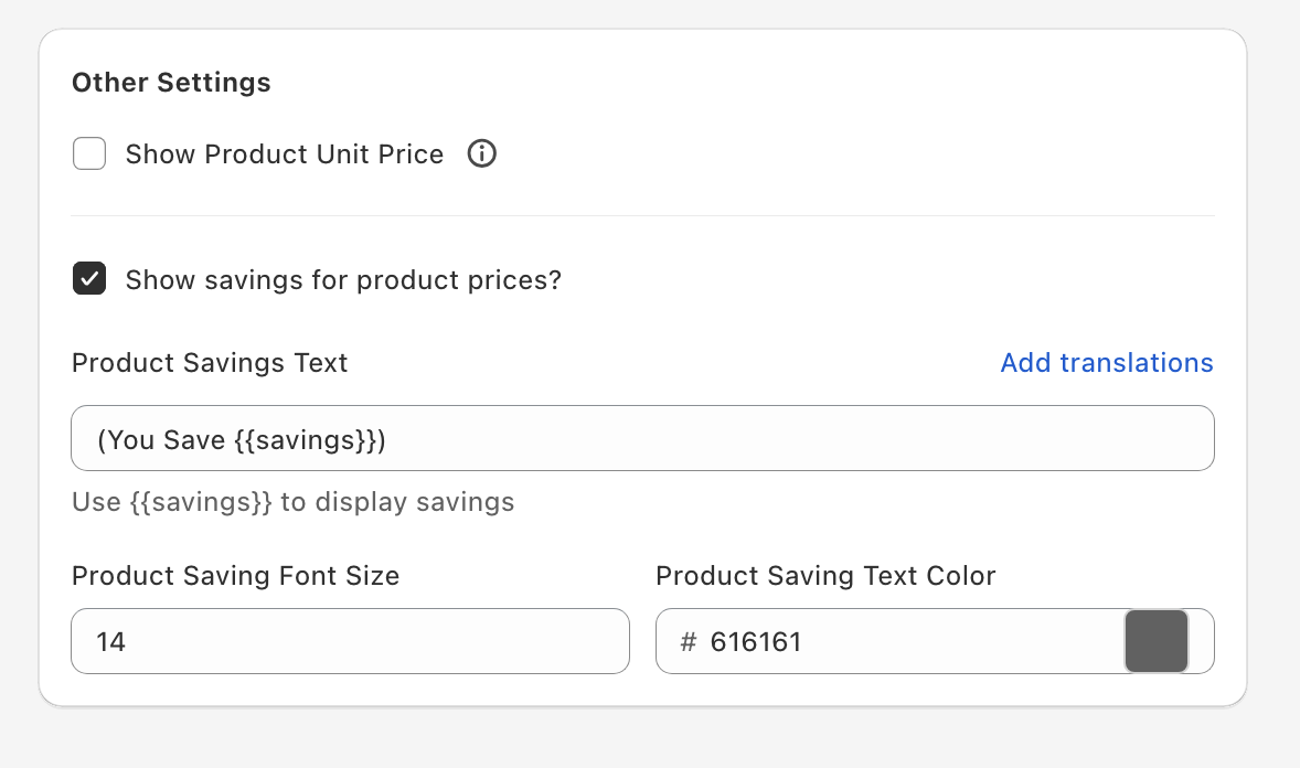
Show savings for product prices
Adds a savings line under the price showing how much the customer is saving on each item (only on lines where they actually save something). Recommended on whenever you run discounts — it makes the discount feel tangible.
Product Savings Text — the savings line template. Default: (You Save {{savings}})
The {{savings}} token is automatically replaced with the actual savings amount in your store's currency. You can rewrite the template with any text:
You Save {{savings}}Saved: {{savings}}You're saving {{savings}} on this item
Make sure to include {{savings}} somewhere in the template — without it, the actual savings number won't be shown.
Product Saving Font Size (px) — default 14. Match this to your subtitle font size for visual hierarchy.
Product Saving Text Color — hex color. The default is a green (#2EA818); some stores prefer a calmer grey (e.g. #616161).
Custom template (advanced)
If you have React (JSX) skills, you can replace this section's built-in layout with your own template. The Custom template card (with Skeleton, Product tile, Variant, Properties, Price, and Volume tiers tabs) appears at the bottom of this panel only after you tick Enable custom template editors under Settings → Custom templates in the Oxify app and save. It needs technical skills, and our support team can't help debug custom templates.
See Custom templates for how to turn the editors on and the props each template receives.
Most stores get the best results by keeping defaults and only adjusting a couple of things: the title color (to match your brand) and, if you like, the savings text color. Heavy customization on every individual element rarely pays off — the defaults are tuned for readability and conversion.
Always preview after making changes. Open the cart in incognito on both desktop and mobile to verify font sizes are readable on smaller screens before saving.