
Empty cart experience
What shoppers see when their cart is empty — and how to convert them anyway.
The empty-cart state is your last chance to recover a shopper before they leave. Don't waste it.
Set it up
- In the Oxify app, go to Home and click Manage Cart Drawer (or Set up Cart Drawer) on the Cart Drawer card to open the Cart Editor.
- In the Cart Editor's left sidebar, click Empty Cart. There is no enable switch for the empty state — it always shows when the cart has no items.
- Edit the Cart Empty Settings card (title, message, optional button).
- Optionally turn on Empty Cart Recommendations and pick products.
- Click Save.
Title
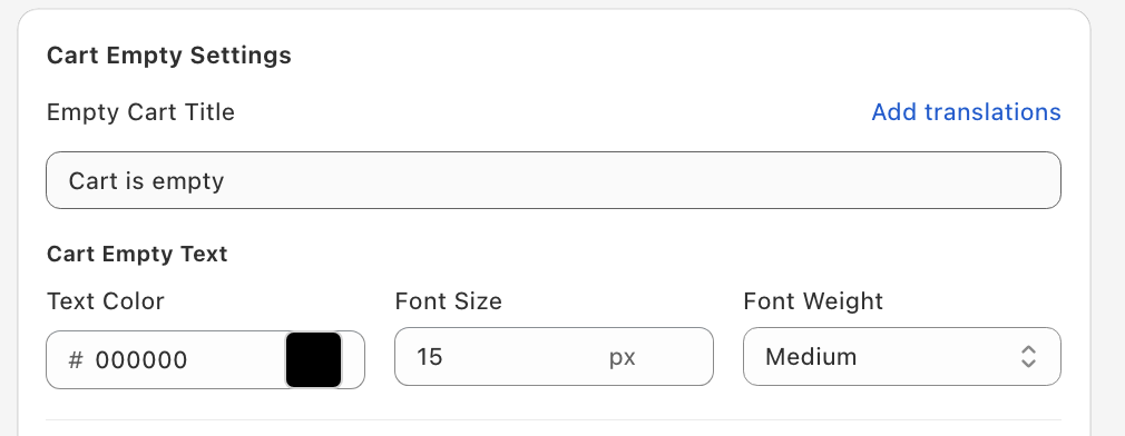
Empty Cart Title — the default is "Cart is empty"; something like "Your cart is empty" works too. Keep it short — one line. The Cart Empty Text controls set its text color, font size, and font weight.
Message
Empty Cart Description — one sentence explaining the next step. Friendly, not apologetic. It's blank by default and has its own text color, font size, and font weight.
Button
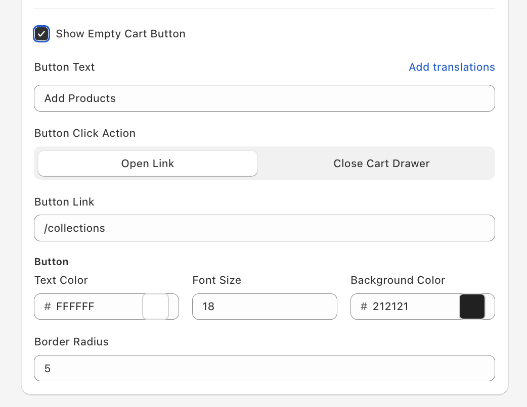
Tick Show Empty Cart Button (off by default) to add a button under the message. Set the Button Text (default "Add Products") and a Button Click Action:
- Open Link — goes to the Button Link (default
/collections). - Close Cart Drawer — closes the drawer so the shopper can keep browsing.
For Open Link, point it to a collection — Bestsellers, New Arrivals, or a curated set. Avoid linking to:
- The homepage (too generic — kills momentum)
- The cart page (a dead loop)
You can also set the button's text color, font size, background color, and border radius.
Recommendations
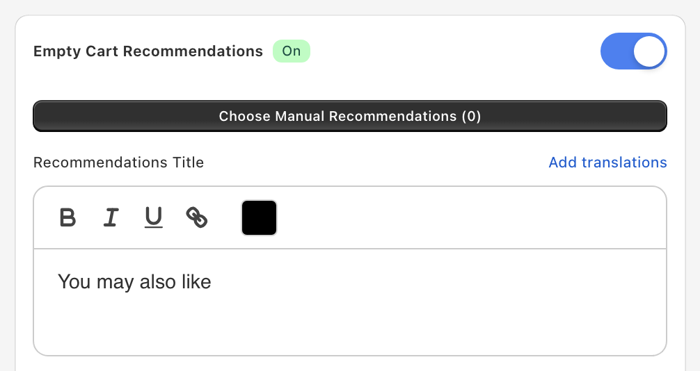
Turn on Empty Cart Recommendations (off by default) to show products directly in the empty state. Click Choose Manual Recommendations to open the product picker; the count of picked products appears in the button label.
- Manual picks — You choose the products by hand (hand-pick proven sellers for the highest conversion). They show in a scrollable carousel with arrows. Products listed under Settings → Upsell Product Exclusions are never shown.
- Recommendations Title (default "You may also like"), the Add to Cart Button Text ("ADD"), the Choose Options Button Text ("CHOOSE"), and the Bottom Sheet Button Text ("ADD TO CART") can all be edited. Once recommendations are on, a Recommendation Styles card controls how the section looks.
Custom template (advanced)
If you have React (JSX) skills, you can replace this section's built-in layout with your own template. The Custom template card (with Empty state and Recommendations tabs) appears at the bottom of this panel only after you tick Enable custom template editors under Settings → Custom templates in the Oxify app and save. It needs technical skills, and our support team can't help debug custom templates.
See Custom templates for how to turn the editors on and the props each template receives.