
Cart upsells
Show product recommendations inside the cart drawer: pick a template, choose how products are picked (Related, Complementary or Manual), and set the texts, position and design of the Upsells section.
The Upsells section adds a row of recommended products to the cart drawer, with an add button on each one. Use it to suggest accessories, refills or best sellers while the shopper is about to check out. No discount is involved: for discounted recommendations, see Cart upsells with discount.
Where to find it: Oxify Cart Drawer → Home → Manage Cart Drawer → Upsells.
Turn it on
In the Oxify app, open Home and click Manage Cart Drawer on the Cart Drawer card. The Cart Editor opens.
In the left menu, click Upsells.
The card at the top reads Upsells Inactive with an Off badge. Click Enable.
Work through the cards below, then click Save in the bar at the top of the editor. Your storefront doesn't change until you save.
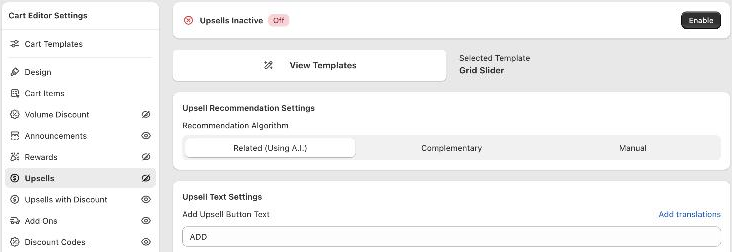
The upsells only show when the cart has at least one item and Oxify found products to suggest. A product that is already in the cart, sold out, or on your upsell exclusion list is never suggested.
The preview fills the upsell row with sample products from your store, so you can judge the design. It doesn't apply your recommendation rules. To check which products shoppers really get, add a product to the cart on your storefront.
Choose a template
Under Selected Template, click View Templates. A sheet titled Choose the Template shows the four looks; click Apply Template on the one you want:
| Template | What it looks like |
|---|---|
| Block & Carousel | The classic card. Shows one product at a time with arrows, or stacks all products (see Upsell Direction below). |
| Grid Slider | Small cards side by side that the shopper swipes through. This is the template a new store starts with. |
| Modern Carousel | A clean carousel with larger cards. |
| Spotlight | Brand-forward cards with a quick-add button. Can show the product's brand. |
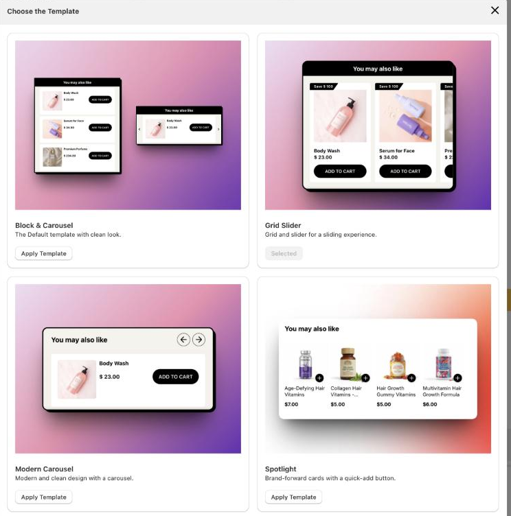
Some settings further down only appear for one template. This page says which.
Upsell Recommendation Settings
Recommendation Algorithm decides which products are suggested.
| Option | How products are picked | When to use it |
|---|---|---|
| Related (Using A.I.) (default) | Shopify's product recommendations for the product the shopper added last. | You want suggestions without setting anything up. |
| Complementary | Shopify's complementary recommendations for the product added last. The card notes that complementary upsells must be configured first (with Shopify's Search & Discovery app); Learn More opens Shopify's guide. | You already set complementary products in Search & Discovery. |
| Manual | Your own rules: "when this is in the cart, suggest that". | You want full control, or different products per market. |
With Manual, two things appear:
- A Market dropdown at the top right of the card, starting on All Markets. Each option shows how many rules it has.
- A Configure Manual Upsells button, with the number of rules for the selected market.
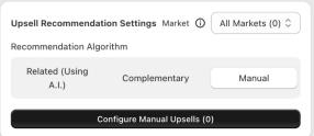
On a narrow screen the Market dropdown moves under the card title.
How to build the rules, and how markets work, is on Set up manual and market-specific upsells.
Upsell Text Settings
Every text field has Add translations, so you can set the text per store language.
| Setting | What it changes | Default |
|---|---|---|
| Add Upsell Button Text | The button on each upsell card. | ADD |
| Choose Options Button Text | The button when the product has more than one variant. Clicking it opens a sheet where the shopper picks a variant. | Choose |
| Bottom Sheet Button Text | The add button inside that variant sheet. | ADD TO CART |
| Save Text | Only with Grid Slider. The save badge on a card whose product has a compare-at price above its price, when Show Compare at Price in Upsell (below) is on. {{amount}} is replaced by the difference. | Save {{amount}} |
| Upsell Title | The heading above the upsells. A small rich-text editor, so you can make words bold or change their color. | You may also like |
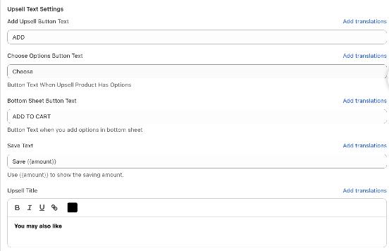
The variant sheet is described on Variant picker behavior.
Upsell Other Settings
| Setting | What it does | Default |
|---|---|---|
| Upsell Position | Where the section sits: Above Cart Items, Below Cart Items (right under the products, in the scrolling area) or At Absolute Bottom (at the bottom of the drawer, above the checkout area). | At Absolute Bottom |
| Upsell Direction | Only with Block & Carousel. Carousel shows one product at a time with arrows. Block stacks every product under each other. | Carousel |
| Limit the number of upsells | Tick it to set your own maximum in Maximum number of upsells to display. The field allows up to 10 products (up to 20 with Manual). | Off: up to 10 products |
| Display 'Related Products' in a side panel on the cart screen. | Only with Grid Slider, desktop only. Shows the recommendations in a panel beside the drawer instead of inside it. | Off |
| Show Compare at Price in Upsell | Shows the product's compare-at price, struck through, next to its price. | Off |
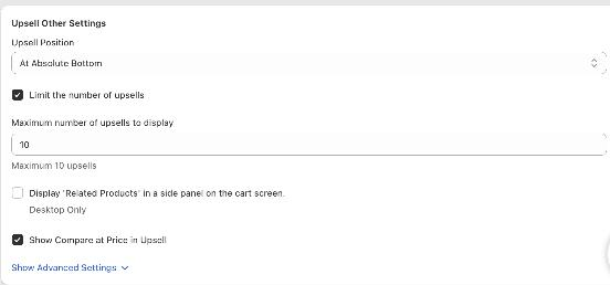
Click Show Advanced Settings for three more:
| Setting | What it does | Default |
|---|---|---|
| Hide reward product in upselling module? | Leaves your free-gift reward products out of the suggestions. It applies to Related (Using A.I.) and Complementary. With Manual, simply don't add those products to a rule. | Off |
| Show Starting From Price in Upsell | For products with several variants, shows the price of the cheapest variant. Set the wording in Starting From Price Text; {{price}} is replaced by that price. | Off, text From {{price}} |
| Save Text Position | Only with Grid Slider. Puts the save badge at the Top of Card or Alongside Pricing. | Top of Card |
Upsell Design
The Upsell Design card holds the colors and sizes. What you see depends on the template:
- Title Bar: font size and background color of the heading (plus text alignment with Spotlight).
- Item Style: card background, border radius, border color and width.
- Card & Image: only with Spotlight: card width, add button size, image fit and padding, and Show Brand Name with its own text style.
- Image: only with Block & Carousel: image width, height, fit, border color and radius.
- Item Title, Item Price and Compare At Item Price: color, font size and weight.
- Savings: only with Grid Slider: the save badge's font size, text color and background color.
- Button: text color, font size, background color and border radius, plus the color of the carousel arrows.
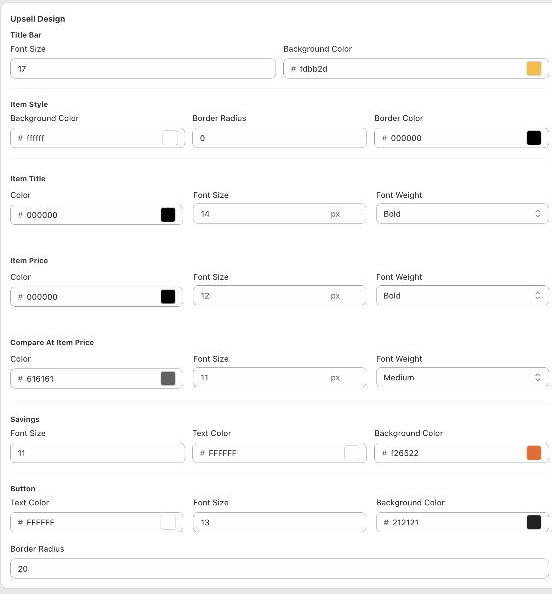
Changes show in the preview straight away.
If custom templates are turned on for your store, a Custom template card also appears at the bottom. See Custom templates.
Add a second upsell section
You can show more than one upsell row, each with its own template, rules, texts and position. For example: a manual "Complete the look" row above the cart items and an automatic "You may also like" row at the bottom.
At the bottom of the Cart Editor's left menu, under Add a Module, click + Add Another Widget.
In Add another widget, choose Upsell.
A new section named Upsells 2 appears in the menu and opens. It has exactly the same cards as Upsells, starts switched off, and starts with the default settings.
Set it up like the main section, click Enable, then Save the editor.
In the menu, each extra section shows an eye icon (open when it is on) and a delete icon. Deleting asks you to confirm; until you save, Discard brings it back. The upsell exclusion list applies to every upsell section.
Related pages
- Set up manual and market-specific upsells
- Cart upsells with discount
- Variant picker behavior
- Review app integrations: star ratings on upsell cards