Design options
Recolor and switch parts on or off for the template you picked: live dot, ring colors, italic headline, seasonal decorations, animations and more.
The Design options card holds the few settings that belong to one template: a handful of colors and some tick boxes. For Dial Rings that means the ring colors and the tick marks. For a seasonal design it means the artwork. Use it to make a template match your brand without leaving the design.
Where to find it: Oxify Countdown → Create timer → Design tab → Design options
Before you start
- Pick a template first. The card shows only for these 11 templates: Ticker Bar, Split Bar, Pill Bar, Dial Rings, Editorial, Progress Segments, Black Friday, Cyber Monday, Christmas, New Year and Valentine's. See Templates.
- The other templates have their own cards. The default layout has no Design options card. The six product page designs (Compact Purple, Minimal Dark, CRO Urgent, Premium Urgent, Flip Clock and Glassmorphism) add a color card instead. See Template-specific colors.
- Choose the template before you tune it. Picking another template puts that template's starting colors back in these fields.
Change an option
On the Content tab, click Browse templates (or Change) and pick one of the 11 templates above.
Open the Design tab. The Design options card sits below Custom template. On a bar it also sits below Positioning, and on a seasonal design below Timer Style.
To change a color, click its swatch and pick a color, or type a hex code such as #E04A17 in the field. The preview updates as you go.
To turn a part on or off, tick or untick its box. Every box starts ticked.
Click Save in the bar at the top of the editor.
The labels in this card use the British spelling "colour", exactly as they appear in the app.
Which template shows which options
| Template | Color fields | Tick boxes |
|---|---|---|
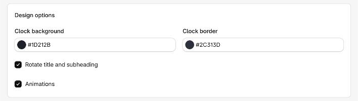
| Ticker Bar | Clock background, Clock border | Rotate title and subheading, Animations |
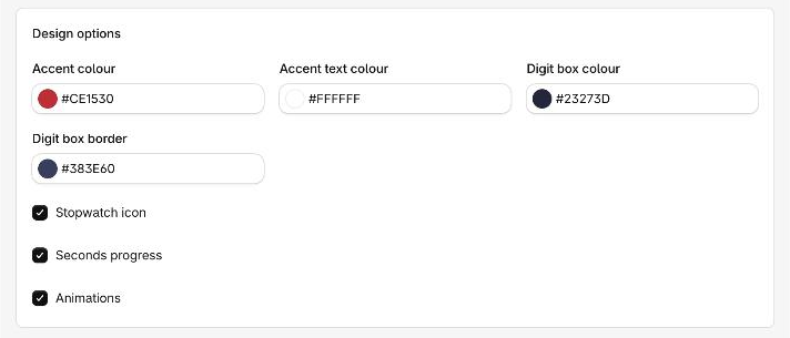
| Split Bar | Accent colour, Accent text colour, Digit box colour, Digit box border | Stopwatch icon, Seconds progress, Animations |
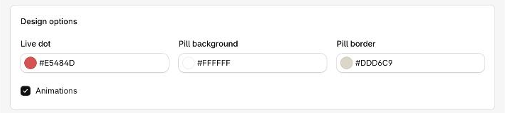
| Pill Bar | Live dot, Pill background, Pill border | Animations |
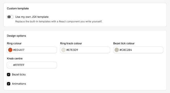
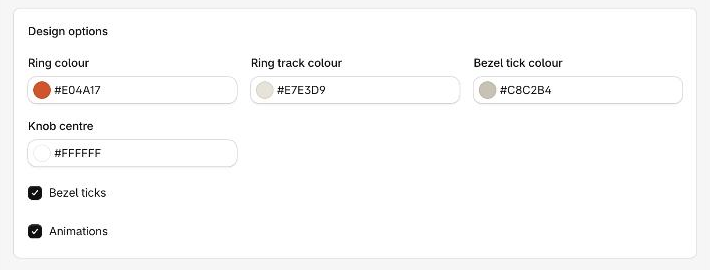
| Dial Rings | Ring colour, Ring track colour, Bezel tick colour, Knob centre | Bezel ticks, Animations |
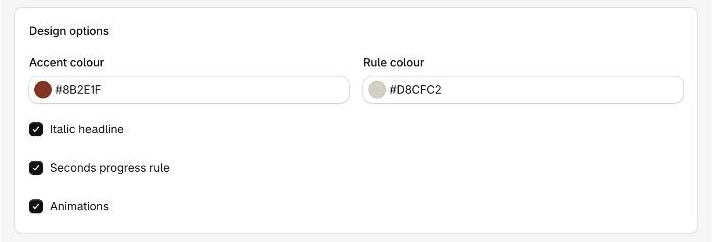
| Editorial | Accent colour, Rule colour | Italic headline, Seconds progress rule, Animations |
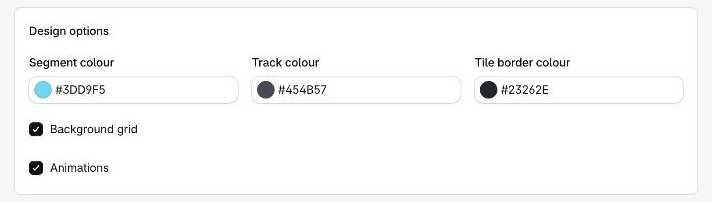
| Progress Segments | Segment colour, Track colour, Tile border colour | Background grid, Animations |
| Black Friday, Cyber Monday, Christmas, New Year, Valentine's | None | Seasonal decorations, Animations |
Animations is on every design. Untick it to stop the movement inside the timer.
Ticker Bar
| Option | What it changes |
|---|---|
| Clock background | The fill of the rounded capsule that holds the clock. |
| Clock border | The outline of that capsule. |
| Rotate title and subheading | When both a title and a subheading are filled in, they take turns on one line. Untick it to show only the title. |
Unticking Animations also stops the rotation and shows only the title.
Split Bar
| Option | What it changes |
|---|---|
| Accent colour | The panel behind the title, the chevrons beside it and the thin line under each number box. |
| Accent text colour | The text on the accent panel. |
| Digit box colour | The fill of each number box. |
| Digit box border | The outline of each number box. |
| Stopwatch icon | The small stopwatch beside the title. |
| Seconds progress | A chevron beside the panel fills and empties with the seconds. Untick it to keep the chevron solid. |
Pill Bar
| Option | What it changes |
|---|---|
| Live dot | The small dot before the title. |
| Pill background | The fill of the rounded pill. |
| Pill border | The outline of the pill and the thin dividers inside it. |
The color behind the pill is the bar's own background. Change it on the Card card. See Background and image.
Dial Rings
| Option | What it changes |
|---|---|
| Ring colour | The arc of each ring, the knob at its end and the small marker at the top. |
| Ring track colour | The pale ring the arc runs along, and the dial face. |
| Bezel tick colour | The tick marks around each dial. |
| Knob centre | The dot in the middle of the knob. |
| Bezel ticks | Shows or hides the tick marks. |
Editorial
| Option | What it changes |
|---|---|
| Accent colour | The short lines beside the subheading and the line under the numbers that shrinks with the seconds. |
| Rule colour | The thin lines between the numbers and along the bottom. |
| Italic headline | Sets the title in italics. Untick it for upright type. |
| Seconds progress rule | Shows the shrinking accent line under the numbers. Untick it to hide the line. |
Progress Segments
| Option | What it changes |
|---|---|
| Segment colour | The lit segments under each number and the small dot beside the title. |
| Track colour | The unlit segments. |
| Tile border colour | The outline of each number tile. |
| Background grid | A faint grid in the top right corner behind the title. Untick it to hide the grid. |
Seasonal designs
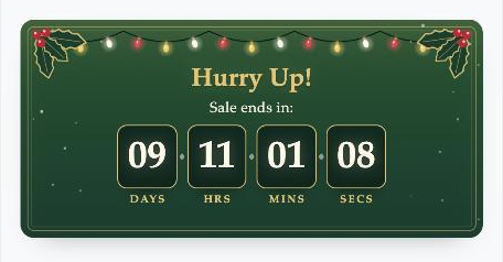
Black Friday, Cyber Monday, Christmas, New Year and Valentine's have no color fields. Their card holds two tick boxes.

Seasonal decorations shows or hides the artwork. Untick it to keep the design's colors and shapes without the extras. Here is Christmas with the decorations on, then off.
The rest of the Design tab
The cards below Design options change with the template and the timer type. A card that does not apply is left out.
| Card | Shown for |
|---|---|
| Custom template | Every timer. See Custom JSX template. |
| Positioning | Top/Bottom Bar timers. See Positioning and sticky bar. |
| Timer Style | The five seasonal designs, except on a cart timer. See Timer style. |
| Card, Spacing, Typography | Every template. See Background and image, Borders, Spacing and Typography. |
| Button | Top/Bottom Bar and Landing Page timers. See Button design. |
| Icons | Top/Bottom Bar timers. See Icon colors. |
Typography hides the rows a design does not use. Pill Bar has no subheading, so its subheading rows are hidden. Ticker Bar and Pill Bar show no unit labels as words, so their label rows are hidden.
If a color change does nothing
Some colors live in other cards. The color of the title text, for example, is on the Typography card, not here. Look there if a color in this card does not change the part you expect.
Next
- Templates: the gallery and all 17 designs
- Template-specific colors: the color cards for the six product page designs
- Typography: fonts, sizes and text colors