Design tab overview
How the Design tab is laid out, what each row controls, and how colors, saving and the live preview work.
The Design tab controls how your builder looks to shoppers. Open a builder from Bundle Builder in the app menu, then click Design — it sits next to Settings and Products.
The rows
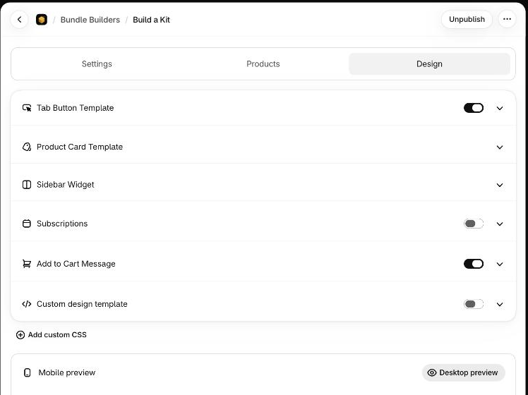
Every group of settings is one row in a single list. Click a row's name (or its arrow) to open it, and click again to close it. A row with a switch can be turned off without losing the settings inside it.
| Row | What it controls | Switch | Guide |
|---|---|---|---|
| Tab Button Template | The tabs or steps above the products, and the category heading. | On by default. Off hides the whole tab row. | Category tabs |
| Product Card Template | The cards shoppers click to add a product. | None. | Product cards |
| Sidebar Widget | The panel with the chosen items, the total and the Add to Cart button. | None. | Sidebar widget |
| Subscriptions | A Subscribe & Save checkbox above Add to Cart. | Off by default. | Subscribe & Save |
| Add to Cart Message | The small message that appears when a product is added. | On by default. Off shows no message. | Add to cart message |
| Custom design template | Your own markup for the layout, tabs, cards, sidebar or message. A number such as (2) appears when custom templates are active. | Off by default. | Custom templates |
| Custom CSS Settings | Your own CSS. Hidden until you click Add custom CSS — it shows by itself once CSS is saved. | Off in a new builder. | Custom CSS |
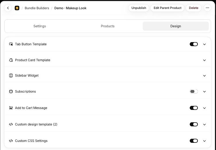
On a builder that already has custom templates and CSS, all seven rows show, as above. Work through the built-in rows first — they keep working when the app is updated — and reach for custom templates or CSS only for what they can't do.
Check your work in the preview
Under the rows, the Mobile preview card shows your builder at phone size. It reads what's on screen right now, so it updates as you change settings — you don't need to save first.
Click Desktop preview to open a full-screen desktop version. Close it with the × in its top-right corner.
Save or discard
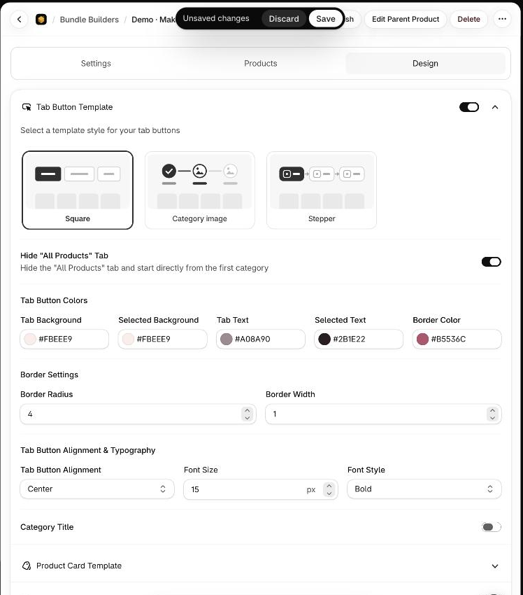
As soon as you change anything, an Unsaved changes bar appears at the top of the app with two buttons.
| Button | What it does |
|---|---|
| Save | Keeps your changes. |
| Discard | Throws away everything changed since the last save and puts the settings back. |
Changing a template, a color or a number never goes live until you click Save. To publish or unpublish the builder itself, see Publish your builder.
Pick colors
Every color setting is a field with a swatch. Type or paste a hex value such as #B5536C, or click the swatch to open the picker.
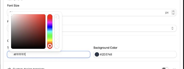
- Three-, four-, six- and eight-digit hex values all work. The last two digits of an eight-digit value set transparency —
#B5536C80is half transparent. - A value that isn't valid hex is ignored; the field keeps its last good color.
Fonts
Where a setting has a Font Size, enter a number in px. Font Style or Font Weight lists Light, Regular, Medium and Bold. The pages in this section follow the order of the settings on screen, so you can read down a page as you scroll down the tab.