
Product cards
Choose a card layout, set how many fit per row, and style the add button.
Product cards are what customers click to add items to their bundle. Style them in Design → Product Card Template.
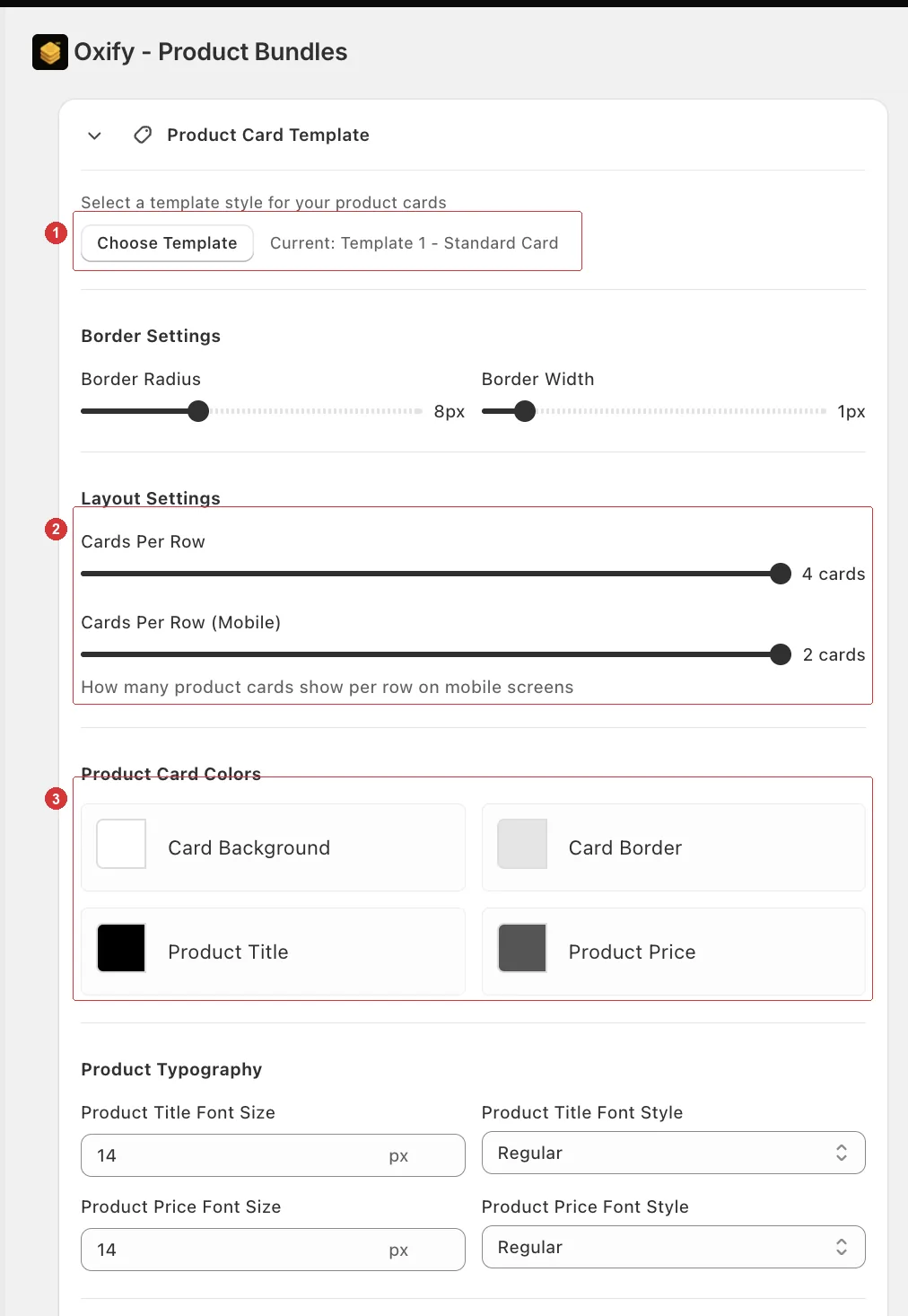
1 the template picker, 2 the desktop and mobile Cards Per Row sliders, 3 the card colours.
Choose a template
Open your builder and go to the Design tab.
Open the Product Card Template card and click Choose Template.
Pick one of the three, then click Done.
| Template | Layout | Best for |
|---|---|---|
| Template 1 — Standard Card | Image on top, details below. | Most catalogues. Supports a quantity selector. |
| Template 2 — Horizontal Card | Image beside the details. | Long product names, size pickers. |
| Template 3 — Centered Card | Centered content. | Small, image-led catalogues. |
The card shows Current: Template 1 - Standard Card so you always know which is active.
Set cards per row
Layout Settings has two separate sliders — desktop and mobile are set independently.
| Slider | Range | Default |
|---|---|---|
| Cards Per Row | 1–4 | 2 |
| Cards Per Row (Mobile) | 1–2 | 2 |
On desktop:
| Per row | Reads as |
|---|---|
| 2 | Generous. Good with large product photos. |
| 3 | Balanced. The usual choice. |
| 4 | Dense. Only with a wide layout and simple images. |
On mobile you only get 1 or 2. Two fits more on screen and suits simple square images; one gives each product real space and works better when your cards carry a variant picker or a long title.
Set the mobile one deliberately
Most Bundle Builder traffic is mobile. Four cards per row looks great on your desktop and tells you nothing about what the majority of your customers see — check both.
The add button
Under Button Customization:
| Setting | What it does |
|---|---|
| Button Text | The label. Defaults to Add. |
| Add to Kit Background / Text | Button colors. |
| Button Border Color / Radius / Width | Button shape. |
| Button Text Font Size / Style | Button typography. |
| Out of Stock Label | What unavailable products show. Defaults to Out of Stock. |
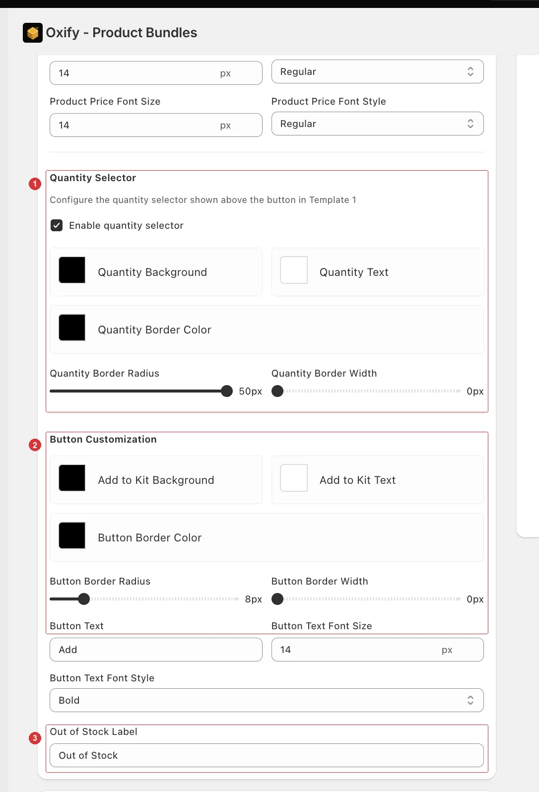
Further down the same card: 1 the quantity selector, 2 the add button, 3 the out-of-stock label.
Quantity selector
Template 1 can show a quantity stepper above the button, so customers add several of one product at once.
Find the Quantity Selector section.
Tick Enable quantity selector.
Style it with Quantity Background, Quantity Text, Quantity Border Color, Border Radius, and Border Width.
A high border radius gives you the pill shape most stores use.
Colors and typography
Product Card Colors covers card background, card border, product title, and product price. Product Typography sets the size and style of the title and price.
Borders or no borders
If your product images already have a white background, drop the card border width to 0 and let the images breathe. Bordered cards suit mixed or transparent imagery.
Need a layout none of the three templates give you?
You can write the card's markup yourself with Custom templates — the app keeps handling variants, pricing, stock, and the cart.