
Sidebar widget
The panel that shows what's in the bundle, the total, and the add-to-cart button.
The sidebar is where the customer sees their progress and checks out. Style it in Design → Sidebar Widget.
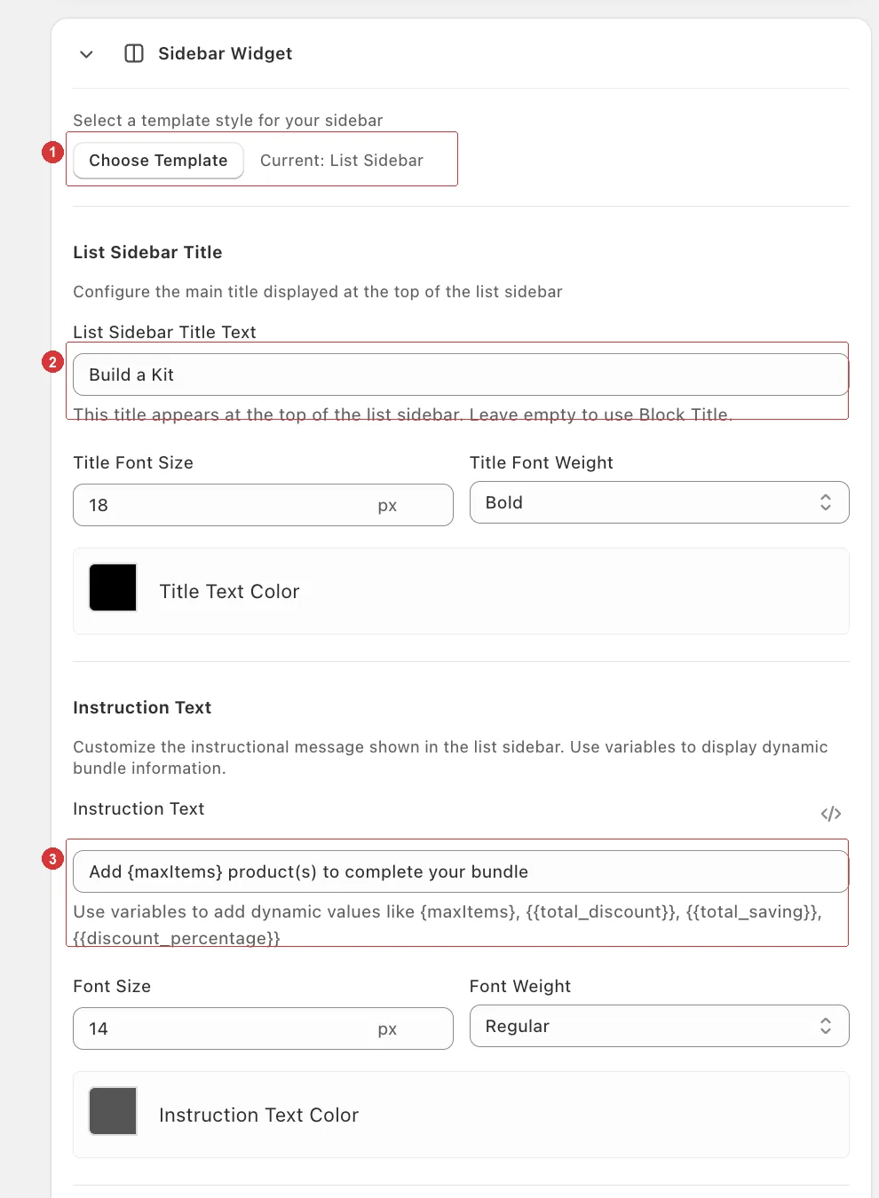
1 the template picker (currently List Sidebar), 2 the title text, 3 the instruction text with its variable tokens.
Choose a template
Open your builder and go to the Design tab.
Open the Sidebar Widget card and click Choose Template.
Pick one, then click Done.
| Template | Layout | Best for |
|---|---|---|
| List Sidebar | A running list of chosen items. | Most builders. |
| Grid Sidebar | Product slots that fill up visually. | Fixed box sizes — the empty slots pull people to finish. |
| Buy Box | A floating box that follows the customer. | Long product lists where the sidebar would scroll away. |
Set the title and instruction
Fill in the sidebar's title field — for example Build a Kit. Leave it empty to fall back to your block title.
Fill in Instruction Text. It supports variables:
{maxItems}— how many items the box needs{{total_discount}},{{total_saving}},{{discount_percentage}}
Click the variables icon in the field to insert one rather than typing it.
A good default: Add {maxItems} product(s) to complete your bundle.
Discount badge
Open the Discount Badge section and make sure its toggle is on. It is by default.
Write your Badge Text. Three tokens are available: {{discount_amount}}, {{discount_percentage}}, and {{discount_value}} for the raw number without a symbol.
Set the badge background and text colors.
The default SAVE {{discount_amount}}{{discount_percentage}} fills in whichever value applies to the selected box.
Add to cart button
Add to Cart Button Colors covers the label (Button Text, default Add to Cart), the active colors, and the disabled colors used while the bundle is incomplete.
Make the disabled state visibly muted. Customers should be able to tell at a glance that they still have items to pick.
Skip the cart
The Builder Settings section has one option:
| Setting | What it does |
|---|---|
| Skip cart and go to checkout | Sends customers straight to /checkout after they add the bundle, instead of opening the cart. |
Worth turning on when the bundle is the order — a build-your-own-box page is often a self-contained purchase, and the cart step just adds a click. Leave it off if you run cart upsells or a free-shipping progress bar that customers should see.
Test a real order after switching it on
Some checkout providers behave differently when the cart is bypassed. Place one test order end to end and confirm the whole bundle arrives at checkout with the right discount.
Sizing and colors
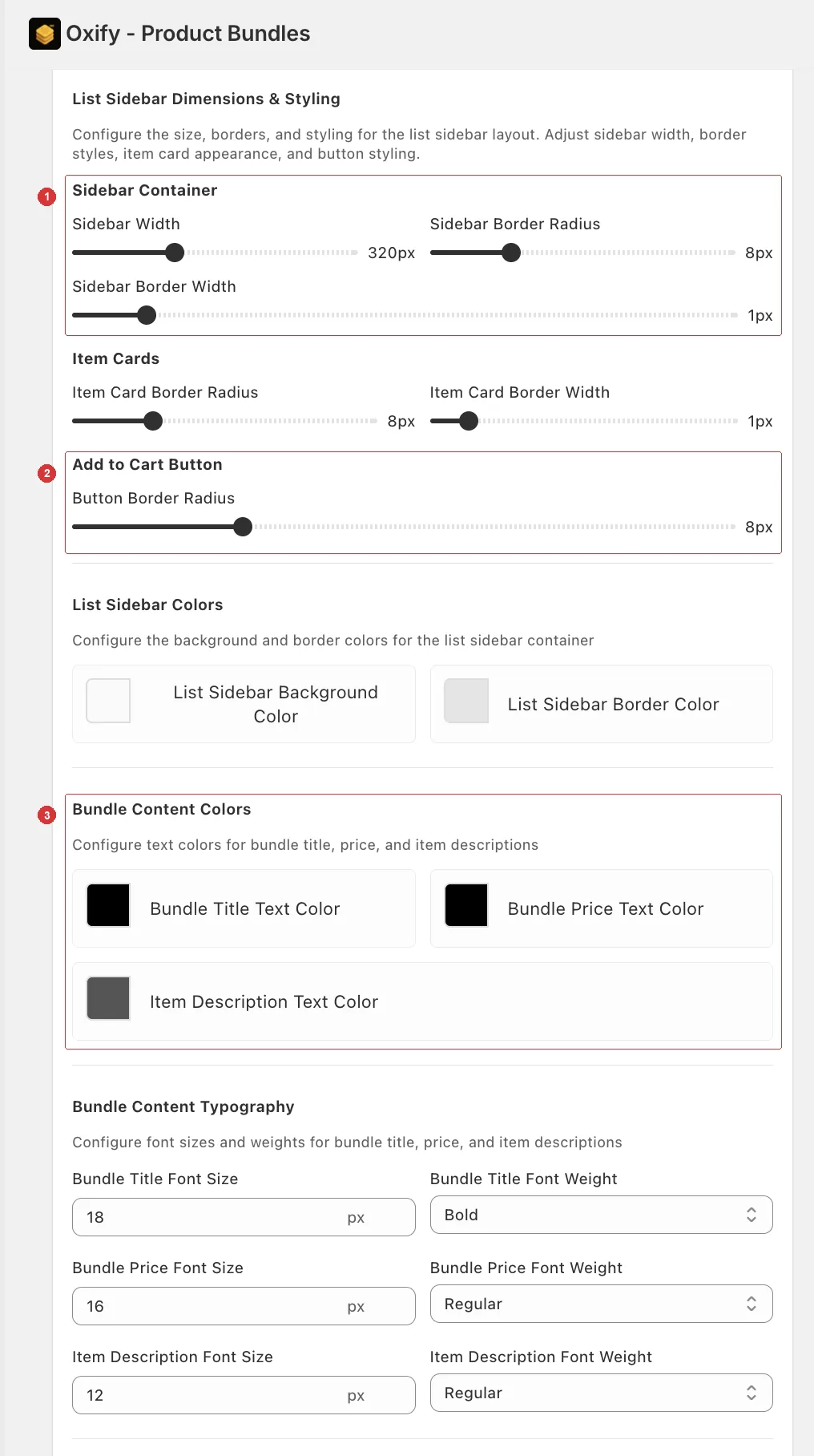
1 the sidebar container width and borders, 2 the add-to-cart button radius, 3 the bundle content colours.
| Section | What you control |
|---|---|
| Dimensions & Styling | Sidebar width, border radius and width, item card borders, button radius. |
| Sidebar Colors | Background and border of the sidebar container. |
| Bundle Content Colors / Typography | Bundle title, price, and item description. |
| Product Slot Colors | Empty and filled slot borders. Grid layout only. |
| Box Selector Tabs | Colors and typography of the box size tabs. Grid layout only. |
Each section is labelled for the template you selected — List Sidebar Colors, Grid Sidebar Colors, or Buy Box Colors — so you always know what you're editing.
Grid sidebar converts well on fixed boxes
Empty slots create an obvious unfinished task. If your builder uses fixed box sizes, try the Grid Sidebar before anything else.
Want the sidebar somewhere else entirely?
Moving the panel above or below the products grid — rather than beside it — is a job for the Full layout custom template.