
Category tabs
Style the tabs customers use to move between your product categories.
Your categories become the tab row at the top of the builder. Style it in Design → Tab Button Template.
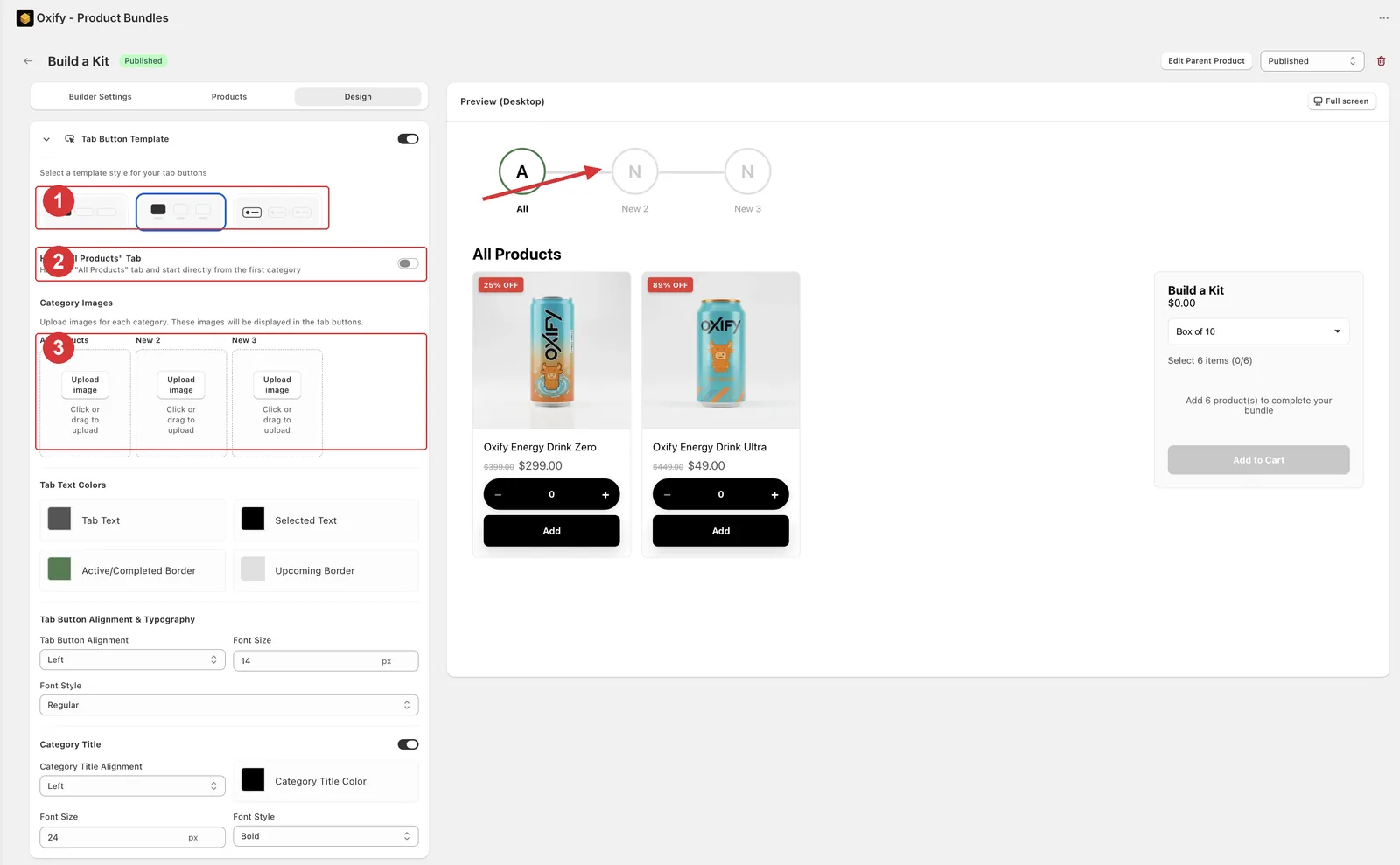
1 the three template previews (Stepper is selected here), 2 the Hide "All Products" Tab toggle, 3 per-category image uploads. The arrow shows the result in the live preview — the numbered stepper across the top.
Choose a template
Open your builder and go to the Design tab.
Open the Tab Button Template card.
Click one of the three previews.
| Template | Look | Best for |
|---|---|---|
| Square | Plain labelled buttons. | Any builder. The safe default. |
| Category image | Each tab carries its own image. | Visual categories — scents, flavours, colors. |
| Stepper | A numbered progress row. | Guided builders with selection rules. |
Hide the "All Products" tab
The builder shows an All Products tab by default. Switch Hide "All Products" Tab on to force customers through your categories one at a time — useful with a stepper.
Add category images
With Category image or Stepper selected, a Category Images section appears listing every category.
Upload an image for each category.
Nothing to upload against? Add your categories on the Products tab first.
Arrows between the steps
Stepper only. The arrows that join one step to the next get their own settings:
| Setting | Options |
|---|---|
| Arrow | Arrow →, Chevron ›, Double », Line —, or None (hide arrows). |
| Arrow color | Hidden when the style is set to None. |
| Arrow size | 10–32px. Defaults to 18px. |
Colors, borders, and text
| Section | What you control |
|---|---|
| Tab Button Colors | Tab background, selected background, tab text, selected text, border, active/completed border, upcoming border. |
| Border Settings | Border radius and border width. |
| Tab Button Alignment & Typography | Left/center/right alignment, font size, font style. |
| Category Title | The heading above the products — alignment, color, font size, font style. |
Not every section applies to every template — the card only shows what's relevant to the one you picked.
Match your theme
Set the tab Border Radius to the same value as your theme's buttons. It's a one-slider change that makes the builder look native.