
Full layout
Rearrange the whole builder — decide where the tabs, grid, and sidebar sit instead of using the built-in arrangement.
Full layout is the one custom template that's different in kind from the other four. They change what a piece looks like; Full layout changes where the pieces go.
Reach for it when the built-in arrangement is the problem — you want the sidebar above the grid instead of beside it, or a section per category, or your own grid container around the cards.
What you get
Every piece of the builder arrives ready-made on props.slots, already wired to data, pricing, and the cart. You place them; the app keeps running them.
That's the starting template the editor gives you — it reproduces the built-in arrangement exactly, so you edit working markup rather than starting from a blank box. (oxify-bb-layout-root is just a plain wrapper with no styles of its own — call it whatever you like.)
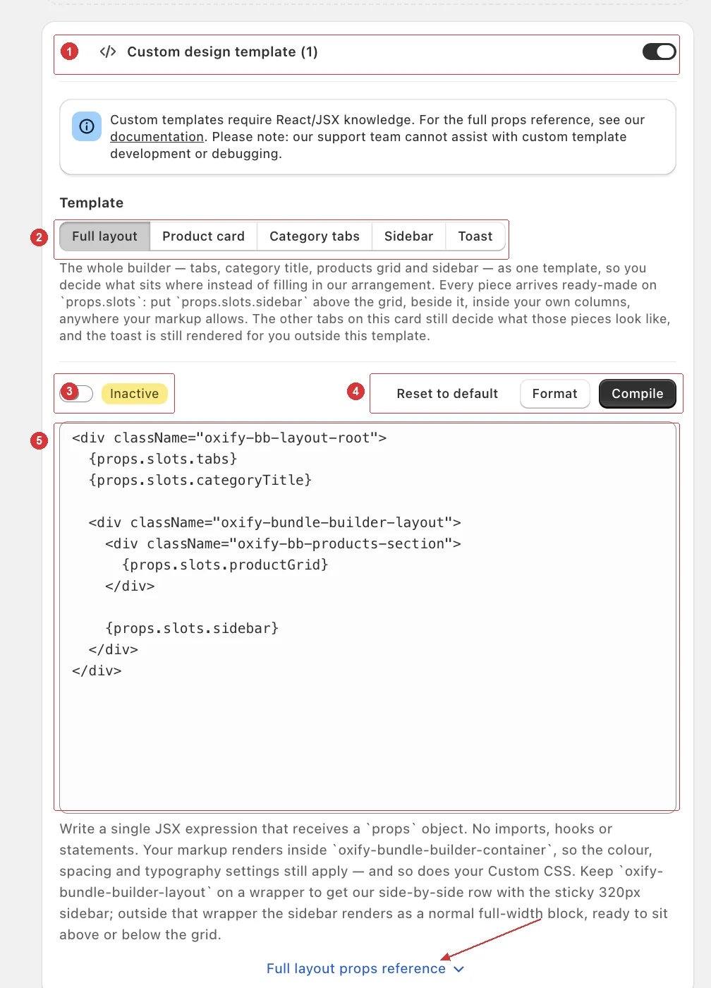
Note the help text under the editor: it repeats the wrapper rule below, so you have it in front of you while you write.
The one class that controls everything
This is the mechanic that makes Full layout click, and it's worth reading twice:
| Where the sidebar sits | What it does |
|---|---|
Inside an oxify-bundle-builder-layout wrapper | The built-in side-by-side row, with a sticky sidebar column that follows the shopper down the page — 320px wide by default, or whatever Sidebar Width is set to in Sidebar Widget. |
| Outside that wrapper | The sidebar automatically becomes a normal full-width, non-sticky block — ready to sit above or below the grid. |
So moving the kit panel from beside the grid to above it isn't a CSS job. You just move the element out of that wrapper, and the sidebar reshapes itself. Inside the wrapper, keep your products in an oxify-bb-products-section so they fill the space beside the sidebar.
On screens 1024px wide or narrower the row stacks and the sidebar becomes a full-width, non-sticky block even inside the wrapper.
Your Design-tab settings keep working
Your markup renders inside oxify-bundle-builder-container, so all the color, spacing, and typography settings still apply — and so does your Custom CSS.
The slots
| Slot | What it is |
|---|---|
props.slots.tabs | The category switcher. null when the merchant turned the Tab Button Template row off. |
props.slots.categoryTitle | The heading above the products. null when the Category Title switch (inside Tab Button Template) is off. |
props.slots.productGrid | The full grid, including loading placeholders and the "no products" message. |
props.slots.productCards | The same cards as a bare array, for when you want your own grid element around them. |
props.slots.sidebar | The kit panel — your Sidebar template if that's active. Includes the Buy Box (Sidebar Widget → Buy Box) when that template is selected; the Buy Box only appears once the kit has an item. |
Guard the nullable slots
tabs and categoryTitle are null when the merchant switched those settings off. Placing a null is harmless — but don't wrap one in your own decorative container, or you'll render an empty box.
Place the sidebar
The Add to Cart button lives in the sidebar. A layout that doesn't place props.slots.sidebar — or build the panel yourself from props.sidebarProps — leaves shoppers with no way to add the bundle to the cart. The same goes for the product grid or cards: leave them out and the shopper sees no products.
The other props
| Prop | What it is |
|---|---|
props.products | The products on screen, in grid order, as { product, categoryId, categoryName, isFirstInCategory, card } — each with its rendered card. Empty while isLoadingProducts is true. |
props.categories | The same products regrouped per category, as { id, name, cards, grid } — each with rendered cards and a ready-made grid element that carries the same columns and styling as the main grid. On the All tab every category appears; on a single tab, just that one. |
props.tabsProps | The Category tabs props bag — exactly what that template receives, for writing the switcher inline instead of placing props.slots.tabs. |
props.sidebarProps | The Sidebar props bag, for writing the panel inline instead of placing props.slots.sidebar. It includes the Subscribe & Save props. |
props.activeCategoryId / props.onCategoryChange | The selected category (or "all"), and a function to switch it. |
props.categoryTitle | Display name of the active category, as a plain string (All Products on the All tab). |
props.isLoadingProducts | True while availability is still resolving and the grid is holding placeholders — only when the merchant hides out-of-stock products. Don't paint prices or counts off products yet. |
props.hasProducts | False when the active category has nothing to show — and also while isLoadingProducts is true, so check that first. |
props.currencyFormat | The store's money format string. |
props.formatPrice | Format any number in the store's currency. |
props.isAdminPreview | True in the admin Preview panel, false on a live storefront. |
Recipe — sidebar above the products, full width
The kit panel is the thing shoppers watch fill up, so it often belongs at the top. No new CSS needed: outside the oxify-bundle-builder-layout wrapper, the sidebar becomes a full-width block on its own.
Move the sidebar line after productGrid for the bottom variant.
Recipe — your own grid around our cards
Keeps every card's behavior — variants, live pricing, stock, add and remove — while you own the container it sits in.
Use props.slots.productCards rather than props.slots.productGrid — the latter brings our grid element with it. The cards are already keyed, so render the array as-is.
Recipe — wrap each card yourself
When you need a wrapper around every card — or a heading before the first card of each category — map over props.products. Each entry's card is the same rendered card, so variants, pricing and stock still work inside it.
Recipe — one section per category
The sectioned page: every category under its own heading, each with a real products grid. category.grid carries the same columns and styling as the main one, so there's no grid CSS to write.
Two things to know alongside it. Leave Hide "All Products" Tab off in Tab Button Template — with it on, the builder starts on the first category and props.categories holds only that one. And this template doesn't place props.slots.tabs, so there's no tab bar for shoppers to switch with — the sections replace it.
What Full layout doesn't change
| The toast | Always rendered outside the layout, so a layout that never places it still shows add-to-bundle confirmations (as long as Add to Cart Message is on). It has its own template for markup changes. |
| What each piece looks like | The Product card, Category tabs, and Sidebar templates still decide that. Full layout only decides where they go — and it picks up those templates automatically when they're active. |
| Per-product behavior | Variant selection, live pricing, and stock stay inside the card. You get the rendered element, not a copy of its state. |
| What happens on an error | If your layout throws while rendering, the app shows the built-in arrangement instead, for the rest of that page view. |
Combine it with the other templates
Full layout and the other four are independent. A common setup is Full layout to move the sidebar up top, plus Product card to restyle the cards — each doing the job it's built for.