
Icon colors
Set the color of the close icon and the rotating navigation arrows.
The Icons card on the Design tab controls the two icons the bar can show.
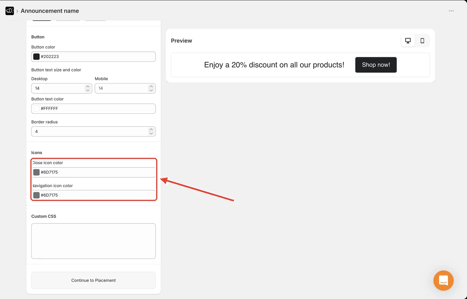
Close icon color
Open the announcement and go to the Design tab.
Find the Icons card.
Set Close icon color.
Click Save.
The close icon only appears if Show Close Icon is ticked on the Content tab. See Close button.
Navigation icon color
In the Icons card, set Navigation icon color.
Click Save.
Navigation arrows only appear on Multiple rotating announcements — they're the back and forward controls a visitor uses to step through the messages. They're always shown on that type; there's no setting to hide them, so this color always applies. See Multiple rotating announcements.
Picking a color
Match the icon color to your title color. It keeps the bar looking deliberate, and it guarantees the contrast is already right — if the title is readable on your background, the icons will be too.
Icons are small, so low contrast hurts them more than it hurts text. A grey close icon on a mid-grey bar is effectively invisible, and visitors who can't dismiss the bar will just leave.